

Creating a Northstar Report Your Team Will Love
Building a concise, context-rich Northstar report that is a compelling read for business stakeholders.

While companies end up with hundreds of dashboards and reports, typically only a small number are used regularly. These reports are high leverage points for most data teams: it's worth investing to make them as effective as possible.
When we look at the usage logs on BI systems we find a small handful of reports are used every day by the executive team and leaders in the business.
These reports are a tremendous opportunity to communicate about the priorities in the business, and can serve as an entry point for numerous follow up questions and key decisions.
– Adam McAskill, Co-founder of Evidence
Unfortunately, typically stakeholders only understand a fraction of the information these reports aim to present, and so they can’t use them to form a cohesive narrative about what’s going on.
These should be the marquee analytics products produced by every data team, but more often than not, data teams don’t feel proud of them.
What is a Northstar report?
A Northstar is a metric that is a measure of long-term success for an organization.
Northstar metrics can come from an OKR system, the balanced scorecard, or another goal-setting system, but the idea of a Northstar report is the same: It tracks progress against the company's Northstar and its most important drivers.
In collaboration with the data team at Zitcha, we've put together this guide to creating a great Northstar report alongside a template project you can use as a starting point.
An excellent Northstar report is both useful and accessible to business executives. In the best case, it's also a report that allows the data team to develop thought leadership in an organization
Make your data useful
When picking reports to invest in, a Northstar report is an obvious choice, as it should have relevance to almost everyone in an organization.
The most useful Northstar reports:
- Focus on one Northstar metric
- Prioritize inputs rather than just outputs
- Decompose metrics into drivers
Let's unpack these a bit.
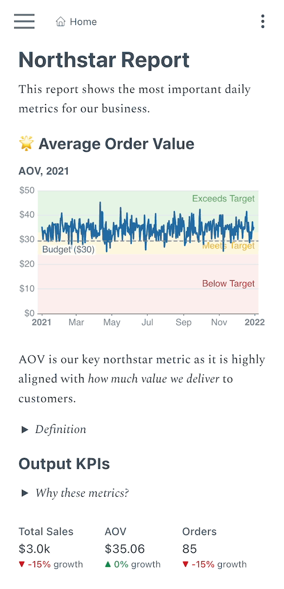
1. Align on a Northstar metric that closely follows user value
Drive focus by choosing (ideally just one) metric as the key measure of success for your organization.
This isn't something you should expect to do alone but in conversation with the leadership team - it's just as important to be aligned as to be right.
You'll know if it's a good metric if it strongly tracks how much value users or customers are getting as a result of what you do.
Some famous examples include:
- Facebook: Monthly Active Users
- Spotify: Total Minutes Listened
- AirBnB: Nights Booked
We track dollars going through our network as the Zitcha Northstar. It's been a journey to socialize it in the business, but it now really drives fire and decision-making clarity for our business.
– Hugh Cameron, Head of Data @ Zitcha
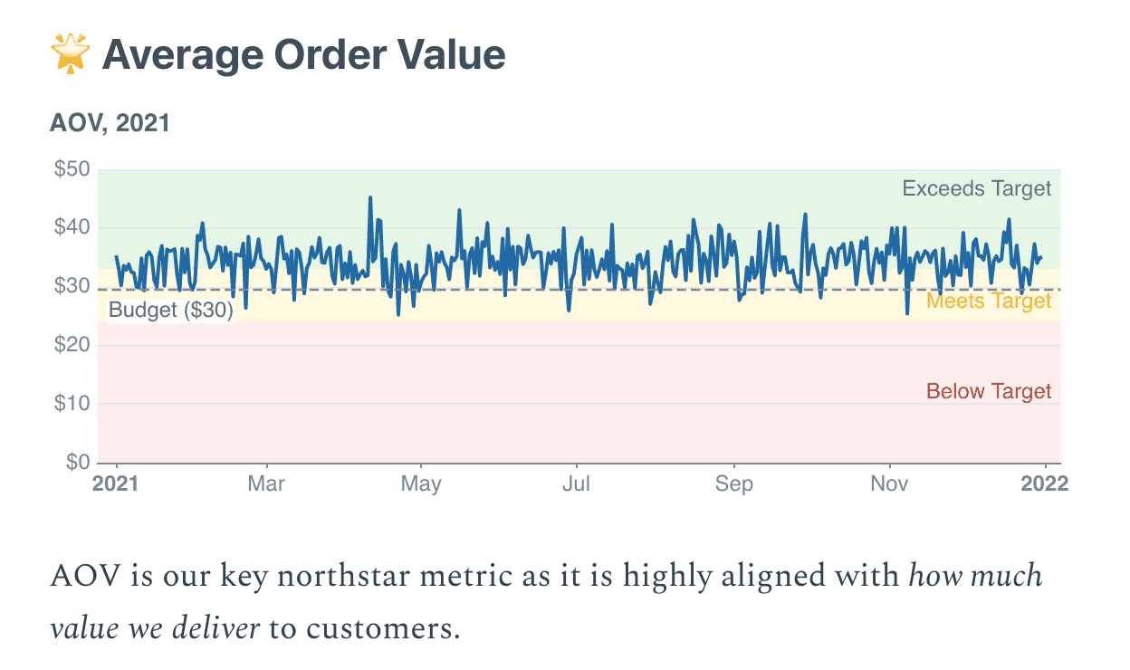
You want to front-and-center this metric in a reader's mind. It might be the one metric that deserves more real estate in the report for this reason.
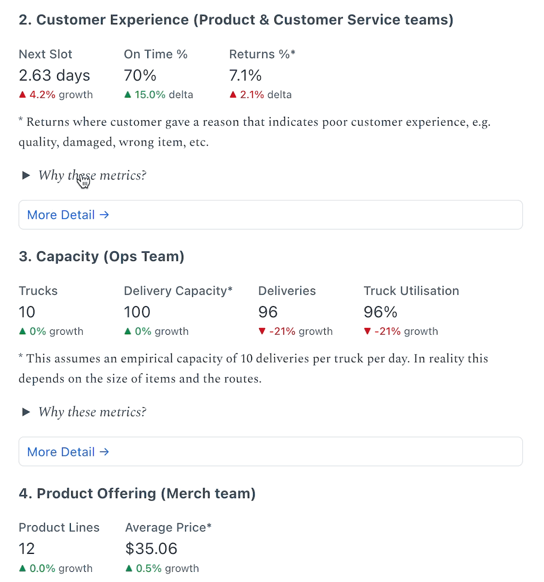
2. Focus primarily on input KPIs over output KPIs
What's the difference between an input KPI and an output KPI? An output KPI is a key measure of business success, but you have limited ability to impact it day-to-day. Stock prices and revenue are examples of output metrics.
The trouble with these KPIs is that many things can cause them to move, many of which are outside your control. Many of them also lag behind the action that your teams are taking.
Input metrics in contrast are controllable and will improve if execution improves.
This is described in Working Backwards by Colin Bryar and Bill Carr who pioneered this approach at Amazon:
- Choose input metrics that if successful will result in improved output metrics in the long term
- Relentlessly focus on improving those inputs.
For example, rather than focusing on NPS to measure customer experience, Amazon chooses to focus on time to the next delivery slot and the number of products available online, as these are key drivers of customer experience.
3. Decompose metrics into drivers
Often top-level metrics are useful to measure but hard to impact. Decomposing metrics into their drivers can help to isolate causes and define actions to impact them.
For example, in an ecommerce business, you can decompose revenue into sub-KPIs:
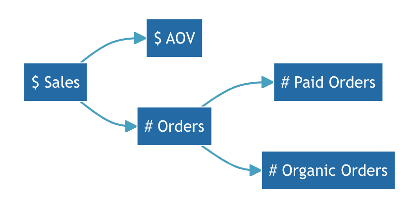
This decomposition is much more useful, as you can define specific initiatives to target each of these metrics much more easily than to impact revenue as a whole.
Make your data accessible
If you want people to use data, you need to go beyond just making it technically feasible for someone to extract the data they need. You need to make it a good user experience.
A good Northstar report:
- Is short
- Is contextualized
- Has low visual noise
- Should be delivered where people work
1. Keep it short
People are busy, so be concise. They may read your report on their phone, in bed when they wake up, on the toilet, in a taxi, or during a 2-minute gap between meetings. If you occupy too much of their time they'll stop reading.
If you want readers to be able to dive deeper into the data, put in a link to another page, report, or resource with additional information. This gives people the option, but not the obligation, to get more detail.
2. Add context to your data
Add required definitions and caveats inline with the data you present in the report. Readers should be able to understand what they are looking at without asking questions.
We add the definitions of each group of metrics in drop-downs below the data. Readers can expand to read the defiintions the first time, or if they forget, but then it doesn't distract them
– Hugh Cameron, Head of Data @ Zitcha
3. Minimize the amount of visual noise
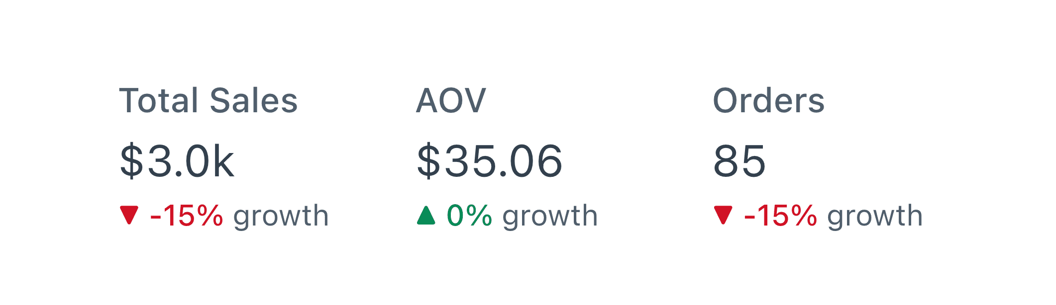
There is a place for lots of charts, but this report is not it. Using text, Big Value-type indicators, and carefully designed tables allows you to focus on just the important numbers.
Readers quickly get a handle on data they are shown regularly, so if you show the last month of data on a daily chart, 29 of those days are numbers they have seen before.
Period-on-period comparison, or comparing vs targets can give the required context without occupying a lot of space.
Sparklines can also be a compact way of showing trend information.
4. Meet people where they are
You need to deliver people data where they work if you want them to pay attention. The right answer depends on the organization and the way it operates.
For some businesses, this is Slack, others a scheduled email, or a web link.
Wherever it is, in 2023, mobile accessibility is a must.
Engagement is about both the medium and the message
If you're struggling to get people to engage with data at your organization, a Northstar report is a great place to start. A concise, focussed report with the right supporting information, delivered directly to people is the ideal format.
A big thank you to Hugh Cameron and Louie Greer from the data team at Zitcha.com, who've been making sure their business is aligned on their key metrics and spoke to us about how they run Northstar reporting for this article.
